

The second half of the season has begun. Those programs that hosted, were fortunate enough to attend holiday tournaments, or began second-half series have done so. It is with the earnest beginnings of the second half of the season that WAFT examines the predictive worth of the first half of the season through examining the last two seasons of college hockey.
The early games of the first half of the 2012-13 season saw many unexpected results. Union, defending its run to the Frozen Four at the end of the 2011-12 season, dropped its opener to Merrimack. Quinnipiac defeated Maine at The Alfond. RIT overwhelmed Michigan offensively in the Wolverines's home opener at Yost. Cornell swept Colorado College convincingly at Lynah.
We have begun to see that Union may not be as competitive in the ECAC as it has been since the 2009-10 season. Quinnipiac is slightly better than initially thought and is poised to earn its second-ever trip to the NCAA Tournament. Michigan has a long road ahead of it if it does not want the 2012-13 season to be the first season in over two decades that the maize and blue have not made the NCAA Tournament. Cornell has proven to be as good as advertised and able to defeat any opponent this season, but has shown that with anything less than its best efforts can surrender upsets of the Big Red juggernaut.
However, the question remains, what predictive value does the first half of the season possess in predicting how a program will fare in the second half of the season when the all-important conference tournaments and national tournament take center stage?
I was engaged in several conversations about the upsets of the early college hockey season during the month of October. I promised one of the people who engaged me that I would perform statistical analysis that determined the predictive worth of a team's first-half performance in calculating how that team would perform overall that season. I compared the record as a winning percentage of each program from the first half of a season to the overall record with which the program finished a given season.
I focused my analysis upon the 2010-11 and 2011-12 seasons. They were the seasons that were most readily accessible for manipulation and tabulation of data. They as the most recent seasons are likely more representative of any other current trends.
I tabulated all the wins, losses, and ties of the 58 NCAA Division I programs that competed during the 2010-11 and 2011-12 seasons at the mid-season point and at the close of competition for each respective season. I marked the mid-season point as December 15. Those games that occurred on or before December 15 were included in the calculation of a team's mid-season record while those that occurred after December 15 were included only in the team's overall season results. This methodology included holiday tournaments, unofficially regarded as the kick-offs of the second half of the college hockey season, as part of the second half of the season and statistically part of only the overall season results in the below model. The tabulated wins, losses, and ties for both mid-season and overall season results were converted to a winning percentage as to enable comparison and mitigate against the difference in the number of games that each program scheduled or could schedule during the first half of the season. The results are below discussed.
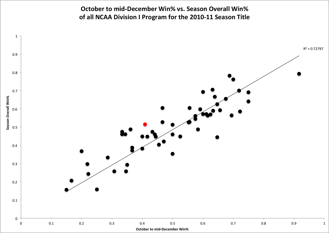
The graph above plots overall season results as a function of mid-season results. Along the horizontal x-axis is a program's winning percentage for the first half of the season while a program's winning percentage for the season overall is plotted along the y-axis. Plotting overall season results as a function of mid-season results provides a means of observing the degree to which a team's first-half performance predicts the overall resulting complexion of a season at the close of competition. The red data point on each chart throughout this post represents Cornell's performance in a given season.
The above graph depicts the performance of all NCAA Division I college hockey programs during the 2010-11 season. The trend line of y=x added to the plot provides a ready means of comparing a given data point to the performance of the program associated with that data point at the mid-season. All data points above the trend line indicate programs that ended the season with overall season records that were improved over their mid-season results. Data points that fall below the trend line are programs whose records were better in the first half of the season than their overall season winning percentage.
The 2010-11 season witnessed Cornell winning only four games before the midpoint of the season and then go on a very Cornell run into the playoffs to the 2011 ECAC Championship Final. This punctuated shift from winning four games in the first half of the season to winning 12 in the second half of the season indicates why Cornell's red data point is far above the trend line. It took a marked change in team dynamic and performance to generate such a significant leap.
The R-squared value appended to the graph provides a good point of comparison of how well the trend line approximates the data set on the graph. The trend line of y=x assume that a team's mid-season performance would be absolutely predictive of the team's overall record. For example, if a team's record was 0.600 at the season's midpoint, the trend line would predict the team to end the season with a 0.600 winning percentage. The poorness of this assumption of absolute predictability is born out in an R-squared value of 0.728. Any R-squared value of less than 0.989 is considered as grounds to assume that the trend line and the data do not correlate sufficiently. Other statistical analysis follows below, but the performance of all 58 NCAA Division I programs in the 2010-11 season indicates that mid-season results are neither absolutely nor very nearly predictive of a team's ultimate record.
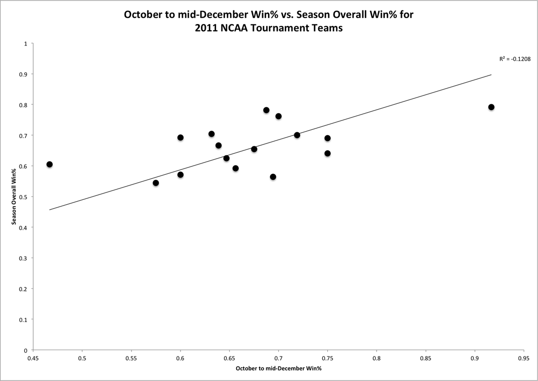 |  |
The next inquiry is to determine if any trends exist between mid-season records and overall season results among the top 16 programs in the nation in a given season that are chosen to participate in the NCAA Tournament. The graph on the left is similar to the first graph of the post. The trend line and its relationship to data points above and below it remain the same. Cornell's red data point does not appear because Cornell did not participate in the 2011 NCAA Tournament.
The R-squared value of -0.121 for the correlation of the trend line to the data set of the 16 teams that participated in the 2011 NCAA Tournament illustrates that for programs that were nationally competitive in the 2010-11 season that there was a somewhat inverse relationship between mid-season records and overall performance of those programs. The -0.121 R-squared value does not lend itself to the conclusion that for participants of the 2011 NCAA Tournament that overall season success was directly inversely proportional to overall season success, but that mid-season success had very little effect upon overall season success. It was less predictively valuable than early season success was to predicting overall season success of all programs in the 2010-11 season.
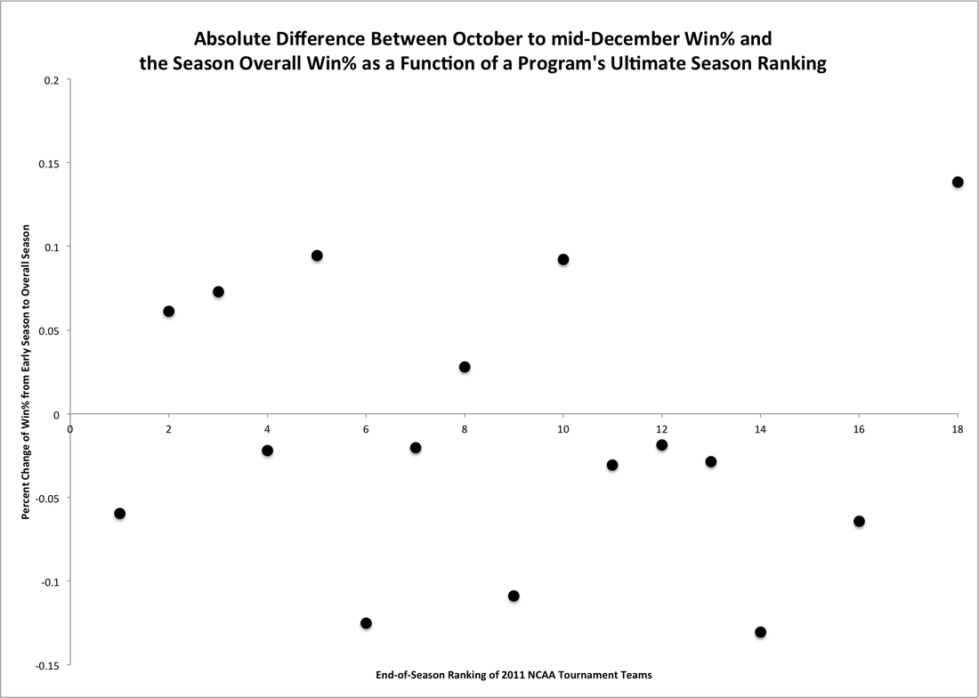
The graph on the right plots the absolute change in winning percentage of a program as a function of a team's ultimate national ranking at the end of the 2010-11 season. The rankings used are from USCHO and are the last ranking of each season, in this specific case the 2010-11 season. Absolute change was chosen as a means of comparison as opposed to percent change because it is more representative of shifts and does not advantage or disadvantage teams based upon their early season performances. Absolute change is a more cognizable and observable measure of a change in a team's performance from the early season to its overall season results.
A negative change in winning percentage occurs for those teams whose records were worse overall than their record was at the midpoint of the season. A positive change indicates those teams who improved their on-ice performance from the early season to their ultimate, overall season performance. The graph on the right highlights that more teams that made the 2011 NCAA Tournament did worse overall in the season than their initial mid-season winning percentage. The 16-team field of the 2011 NCAA Tournament saw 10 teams, including the ultimate national champion of Minnesota-Duluth, compete whose early season winning percentage was better than their overall winning percentage.
There exists little correlation between rank and change in winning percentage in the field for the 2011 NCAA Tournament. Exactly two of the Frozen-Four participants improved their overall season winning percentage over their early-season winning percentage. The same split continues for those teams that ended the season ranked in the top eight of the nation for the 2010-11 season.
The R-squared value of -0.121 for the correlation of the trend line to the data set of the 16 teams that participated in the 2011 NCAA Tournament illustrates that for programs that were nationally competitive in the 2010-11 season that there was a somewhat inverse relationship between mid-season records and overall performance of those programs. The -0.121 R-squared value does not lend itself to the conclusion that for participants of the 2011 NCAA Tournament that overall season success was directly inversely proportional to overall season success, but that mid-season success had very little effect upon overall season success. It was less predictively valuable than early season success was to predicting overall season success of all programs in the 2010-11 season.
The graph on the right plots the absolute change in winning percentage of a program as a function of a team's ultimate national ranking at the end of the 2010-11 season. The rankings used are from USCHO and are the last ranking of each season, in this specific case the 2010-11 season. Absolute change was chosen as a means of comparison as opposed to percent change because it is more representative of shifts and does not advantage or disadvantage teams based upon their early season performances. Absolute change is a more cognizable and observable measure of a change in a team's performance from the early season to its overall season results.
A negative change in winning percentage occurs for those teams whose records were worse overall than their record was at the midpoint of the season. A positive change indicates those teams who improved their on-ice performance from the early season to their ultimate, overall season performance. The graph on the right highlights that more teams that made the 2011 NCAA Tournament did worse overall in the season than their initial mid-season winning percentage. The 16-team field of the 2011 NCAA Tournament saw 10 teams, including the ultimate national champion of Minnesota-Duluth, compete whose early season winning percentage was better than their overall winning percentage.
There exists little correlation between rank and change in winning percentage in the field for the 2011 NCAA Tournament. Exactly two of the Frozen-Four participants improved their overall season winning percentage over their early-season winning percentage. The same split continues for those teams that ended the season ranked in the top eight of the nation for the 2010-11 season.
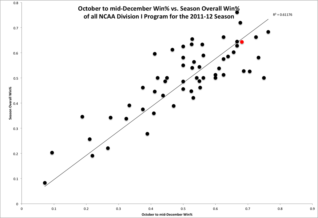
The next step in my statistical analysis was to expand the scope of inquiry to include last season. The three graphs analyzed for the 2010-11 season and discussed above are generated above and below for the 2011-12 season. The above graph shows the trend line of y=x as well as the red data point for Cornell's performance.
Cornell last season relied upon one of the nation's top recruiting classes to overwhelm many early season competitors. Cornell dropped a disappointing season opener to Mercyhurst and then proceeded not to allow a goal against at Lynah Rink for the remaining first half of the 2011-12 season. Cornell completed the first half of the 2011-12 season with a 0.682 winning percentage. The Big Red could not keep pace with that laudable number as it proceeded to close the season with an upset of Michigan in the 2012 NCAA Midwest Regional Semifinal in Cornell's penultimate game of the season and a final season winning percentage of 0.643. The slight drop in winning percentage between Cornell's at the midpoint of the 2011-12 season and its overall season winning percentage is shown with the placement of the data point representing Cornell below the trend line.
The R-squared value of 0.612 for the goodness of fit between the model of the trend line for absolute prediction of overall winning percentage by winning percentage at the mid-season point indicates that it was a worse approximation in the 2011-12 season than it was in the 2010-11 season. The data from both seasons indicate that there is no absolute predictive value of a team's early season winning percentage at the midpoint of the season and a team's overall season winning percentage at the close of seasonal competition.
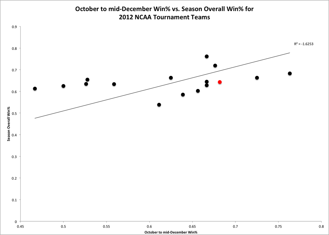 |  |
The next step again was to isolate the 16 teams that were selected for the 2012 NCAA Tournament to determine if any trends existed among the 16 best teams from the 2011-12 season of NCAA Division I college hockey. Cornell's red data point appears because Cornell earned a berth to the 2012 NCAA Midwest Regional. Once again, paradoxically, there is a negative R-squared value for the goodness of fit between the data set of the 16 teams that competed in the 2012 NCAA Tournament and the assumption that early season performance was absolutely predictive of overall season results.
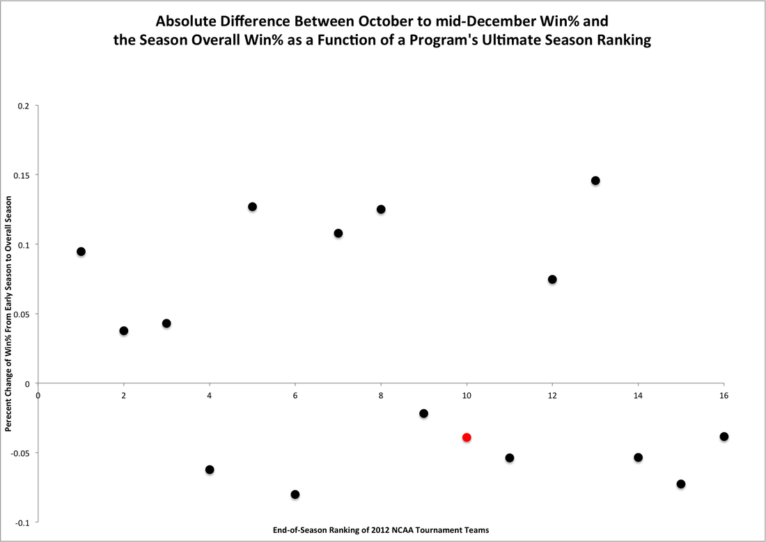
The above graph on the right shows the absolute change between mid-season and overall winning percentage as a function of the season's final USCHO ranking of teams that competed in the 2012 NCAA Tournament. The data for participants of the 2012 NCAA Tournament is more evenly divided than that of the 2011 NCAA Tournament. Eight of the participants in the 2012 NCAA Tournament improved their overall winning percentage relative to their mid-season winning percentage while eight of the participants worsened their overall winning percentage relative to their early season performances. Participants in the 2012 Frozen Four again were divided evenly between those who improved and worsened their performances.
The last two seasons have witnessed four of eight Frozen-Four participants improve their overall season performances relative to their mid-season performances. Those Frozen-Four participants include national champions in Minnesota-Duluth and Boston College that worsened and improved their performances respectively. Interestingly, 18 of the 32 participants that competed in the last two NCAA Tournaments had a worse overall season winning percentage than early-season winning percentage.
The conclusions that can be drawn from this data set are that improvement or underperformance relative to early season winning percentage is not correlated with overall season success among the most successful programs in a given season. Meanwhile, programs that tend to perform well in the first half of the season and underperform in the second half of the season tend to fill the field of the NCAA Tournament.
This fact in itself should not be surprising as most out-of-conference games occur for most programs in the first half of the season. These out-of-conference clashes lend themselves to obtainment of pairwise points that are crucial to selection to the NCAA Tournament. Teams that are dominant early in the season and get pairwise points when they are available in out-of-conference games are rewarded with slightly disproportionate selection to the NCAA Tournament at the end of the season even if they underperform in the second half of the season.
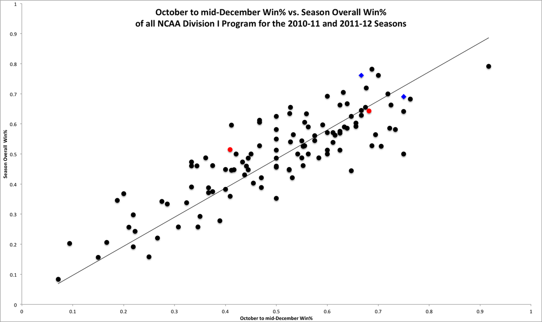
The final step in my analysis was to aggregate both sets of data for the 2010-11 and 2011-12 seasons into a combined graph for analysis. I did not subject the data to R-squared analysis for two reasons. Foremost, R-squared analysis is a crude approximation that is used for discerning gross trends rather than any real statistical specificity. Secondly, the graphical data and preliminary R-squared values discussed above indicate that no simplistic (linear or quadratic) approximation would yield an acceptably accurate predictive model between early season success measured as the winning percentage at the midpoint of the season and ultimate, overall season success at the completion of a season. The graph of the aggregated data sets from both seasons is above shown.
The two red data points represent Cornell's performance in each season. The trend line again has the same relationship as it has in the previous graphs. The blue diamonds on the graph indicate the national champions of each season. The graph includes 116 data points of all 58 NCAA Division I programs from both the 2010-11 and 2011-12 seasons. The use of more data points across two seasons helps to mitigate possible anomalies in the results or dynamics of the game confined to one season.
A quick examination of the combined-data graph above supports the conclusion that even though winning percentage at mid-season is not absolutely predictive of overall winning percentage, there is some degree of correlation. The graph appears to stratify into bands of ranges of winning percentage. Comparison of data-point placement relative to the trend line shows that programs both under- and over-perform relative to their winning percentage at mid-season. However, the range of under- and over-performance is bounded by a given range. The data indicates that there is, predictably, a reasonable range of variation between first-half season performance and overall season performance. The predictive value of early season winning percentages is suspect in some respects. The start to a season bounds the ultimate likely success of a team. This is a function of the fact that by the mid-season point, it has become apparent how good a team actually is that season. However, these bands of variation are significantly large.
The data can yield a more precise model. There are two means of calculating the average change between early season winning percentage and overall season winning percentage. The distinction is use of absolute change in winning percentage and percent change in winning percentage. The former yields the average change of -0.006 between winning percentage at the season's midpoint and the overall results. The latter produces an average change of 2.63% between winning percentage at the end of the first half and the ultimate, overall season performance.
The average change of early season and overall winning percentage of -0.006 is relatively small. The range from the last two seasons includes a maximum positive change of 0.184 and a maximum negative change of 0.250. The former belongs to St. Lawrence from the 2011-12 season when the Saints won seven games in the first half of the season with a winning percentage of 0.412, and then won seven more games and owned a 0.596 winning percentage by the conclusion of the season. The latter belongs to Ohio State in the 2011-12 season when the Buckeyes won 13 games in the first half of the season and proceeded to add only two more win in the remainder of the season causing their winning percentage to decline from 0.750 to 0.500.
The extremes are interesting in their own right, but neither of the programs that are represented by an extreme value were competitive nationally in the last two seasons. The two extremes show that most nationally successful or competitive programs fall within a reasonable band or range. The standard deviation from the average change between first half and overall winning percentage is a more relevant criterion to any possible model. The standard deviation is 0.084. The band or range of variation of winning percentage from early season winning percentage compared to overall season winning percentage is a change of -0.090 to 0.078.
The range of -0.090 to 0.078 approximates well the range of variation between the average team's performance overall in a season and its performance during the first half of a season. This represents a range of 0.168. This indicates that there is a wide array of statistically likely overall season winning percentages based upon a team's first half winning percentage. Despite the dispositive weight that some attribute to first-half performances and winning percentages, statistics indicates that the ultimate success and overall winning percentage of a team in a given season is largely independent of early season results.
Data from the participants in the 2011 and 2012 NCAA Tournaments indicate this fact. A majority of the teams to participate in those tournaments did worse in the second half than they did in the first half of each respective season. This supports the conclusion that winning percentage in the first half of the season may be a good indicator of obtainment of a berth in the NCAA Tournament, but a poor indicator of overall season winning percentage and ultimate national success. The equal division of Frozen-Four participants and national champions over the last two seasons between teams that under- and out-performed their own early season winning percentages at season's end highlights the lattermost point.
Tomorrow, WAFT will apply some of the above information and statistics to analyze the relationship between Cornell's early season successes and its degree of ultimate success in those seasons in Part Two of this analysis of the predictive value of first-half success and overall success in a season.


 RSS Feed
